Kamis, 31 Oktober 2013
Rabu, 30 Oktober 2013
Home of interiorista Athena Calderone in Suffolk
When Athena and Victor Calderone first saw the beach house in Amagansett, New York, it was love at first sight. After a year of searching, they hadn’t come across anything like it—a 1960s house with clean lines and clerestory windows that let in plenty of natural light.
They bought the property in May 2009. “We literally painted everything white,” explains Victor. The kitchen, which was tucked away in a cramped corner, would be moved closer to the main living space. They would also expand the master bath. But their primary goal was to give the whole house a laid-back feel that walked a fine line between modern and rustic.
After finding the right place, they were determined to make it reflect their personalities. Athena began collecting vintage and antique furniture and accessories from local sources. She created texture by installing reclaimed-pine boards on interior surfaces, repurposing wooden beams as kitchen shelves, and adding leather pulls to the kitchen and bathroom cabinetry.
The Calderones hired Sag Harbor architect Paul Masi, who expanded the four-bedroom home’s footprint from 2,000 to 2,400 square feet. One of Masi’s most welcome suggestions was to use thick woven Manila rope as a finishing treatment on the ceilings. The rope offers more than a decorative element. Lengths of line hang from the ceiling to support major pieces, such as a light fixture above the dining table and a mirror in the master bath.
The result is a deeply comfortable home with layers of history as well as tactile pleasures. “It’s very much a beach house, but it also feels like a cabin in the winter".
Minggu, 27 Oktober 2013
Does anyone actually read my blog?
Your friends and family keep you on your toes and often unwittingly provide great fodder for blog posts! They also cause a scattered examination of conscience. Two recent questions about my blogging ( I have a painting blog and a home decorating blog) got me thinking about my purpose and audience, and the time I invest in this activity. This post is about Designing Home blog
Audience
I am happy to report that people do indeed read Designing Home blog. Since I began it almost three years ago, I've had over .25 million page views. That surprised even me because I originally began to write this blog with a local audience in mind. I couldn't be further from the mark.
My readership is 6 times larger in the United States than Canada. Canada, Great Britian, Australia and Germany are almost tied in interest. Only a small percentage of readers are actually from Newfoundland. No doubt it is a global village.
Topics
I am glad that my original prediction about audience was correct. The average homeowner appears to welcome clear information about basic decorating issues. You now, the kind of questions you have if you live in an average size home and decorate with a modest budget. Personally that means a very modest budget layered with a lot of DIY. While I write about other topics that appeal to smaller audiences, I try to keep my focus "sensible". Here are the top five posts on Designing Home:
It appears that many people have issues with small rooms and are looking for creative ways to use space. Window treatments, accent walls and hanging light fixtures are topics that everyone thinks about.
Purpose
Why would I use a chunk of my valuable time to write?
The biggest joke of all is I don't actually enjoy writing. I find it labour intensive and a clumsy way to provide knowledge although I am an avid reader. I am definitely a face to face communicator who needs the visual signals of my audience to be completely comfortable. It comes from years of teaching both children and adults. I am also a huge synthesizer. I like to get things down to the bare bones quickly. A colleague once told me I write like a machine gun. I am obviously not a highly verbal person - I am a doer.
But.... I love to organize and share information. It just makes me happy. The learner/ synthesizer function wins.
Blogging also provides a forum to research questions or problems that arise as I work with clients. It has expanded my horizons in so many ways when it comes to interior design. The design community is diverse and blogging keeps me in touch with trends from around the world. That is a necessity when you live on an island where attitudes can tend toward the provincial and predictable.
Blogging increases your credibility. When you have a blog /website as I do, you have a showcase for your understanding of design issues and people can anonymously " check you out". There are lots of lurkers out there from my stats. 2542 people checked out my portfolios , 798 read my design statement and 540 wanted to know more about me.
Yes, people are reading my blog. It serves its purpose.
Signing out from my not so decorative small computer space....
Audience
I am happy to report that people do indeed read Designing Home blog. Since I began it almost three years ago, I've had over .25 million page views. That surprised even me because I originally began to write this blog with a local audience in mind. I couldn't be further from the mark.
My readership is 6 times larger in the United States than Canada. Canada, Great Britian, Australia and Germany are almost tied in interest. Only a small percentage of readers are actually from Newfoundland. No doubt it is a global village.
Topics
I am glad that my original prediction about audience was correct. The average homeowner appears to welcome clear information about basic decorating issues. You now, the kind of questions you have if you live in an average size home and decorate with a modest budget. Personally that means a very modest budget layered with a lot of DIY. While I write about other topics that appeal to smaller audiences, I try to keep my focus "sensible". Here are the top five posts on Designing Home:
Mar 4, 2012, 16 comments | |
Jun 14, 2011, 9 comments | |
Jan 30, 2011 |
PSCBATH
It appears that many people have issues with small rooms and are looking for creative ways to use space. Window treatments, accent walls and hanging light fixtures are topics that everyone thinks about.
Purpose
Why would I use a chunk of my valuable time to write?
The biggest joke of all is I don't actually enjoy writing. I find it labour intensive and a clumsy way to provide knowledge although I am an avid reader. I am definitely a face to face communicator who needs the visual signals of my audience to be completely comfortable. It comes from years of teaching both children and adults. I am also a huge synthesizer. I like to get things down to the bare bones quickly. A colleague once told me I write like a machine gun. I am obviously not a highly verbal person - I am a doer.
But.... I love to organize and share information. It just makes me happy. The learner/ synthesizer function wins.
Blogging also provides a forum to research questions or problems that arise as I work with clients. It has expanded my horizons in so many ways when it comes to interior design. The design community is diverse and blogging keeps me in touch with trends from around the world. That is a necessity when you live on an island where attitudes can tend toward the provincial and predictable.
Blogging increases your credibility. When you have a blog /website as I do, you have a showcase for your understanding of design issues and people can anonymously " check you out". There are lots of lurkers out there from my stats. 2542 people checked out my portfolios , 798 read my design statement and 540 wanted to know more about me.
Yes, people are reading my blog. It serves its purpose.
Signing out from my not so decorative small computer space....
As you can see, I live in a very average space and I am also a little sloppy at times. Why I have a pair of pliers on my desk is a mystery. This desk came from a contractor friend who renovated a university residence. The walls are BM CC 460 inukshuk and the desk is painted BM HC 69 whitall brown. The resident carpenter built the bookcase to fit the equipment.
Jumat, 25 Oktober 2013
And more aqua
This must be aqua week! I am noticing it everywhere. After writing a post yesterday about aqua, I opened one of the blogs I follow this morning to be greeted by a lovely room make -over by Kelly Porter of Color Sizzle and the walls are painted aqua. The accents are red. I wanted to share this lively combination. While it is too much colour for me, I know it will appeal to lots of my readers.
Pillow and lamp love on my part!
And another living room with the same colour scheme, but the colours are used in a very understated way. It is all about the intensity of the hues.
Which room would you be most comfortable in?
Kamis, 24 Oktober 2013
May I suggest aqua?
Although I am interested in the latest colour trends in home decor, I am not a slave to them. I choose gray as the neutral in my house in 1986 and it wasn't a growing trend until 2011! It will still be my neutral ten years from now because I feel comfortable with gray as a backdrop.
We should all choose colours for our homes that we like. My first order of business in a colour consultation is to determine what kind of colours a client really likes. Next I check the room's light orientation and lastly I look at the furniture and art in a space.
I just went through all my pins on my colour inspiration board on Pinterest to look for trends in my own pinning. I have quite a few with aqua. I do not have aqua in either of my homes, but I am obviously attracted to it because I love blue greens. How about you?
Aqua is a versatile, fresh colour as you can see from the interiors below. You can use it for an accent wall, to paint furniture, in pillows, or even on a ceiling....use a little or a lot....
And here we have the merest hint of a dark aqua with magenta and off white. This is a great way to have pops of colour without over committing.
We should all choose colours for our homes that we like. My first order of business in a colour consultation is to determine what kind of colours a client really likes. Next I check the room's light orientation and lastly I look at the furniture and art in a space.
I just went through all my pins on my colour inspiration board on Pinterest to look for trends in my own pinning. I have quite a few with aqua. I do not have aqua in either of my homes, but I am obviously attracted to it because I love blue greens. How about you?
Aqua is a versatile, fresh colour as you can see from the interiors below. You can use it for an accent wall, to paint furniture, in pillows, or even on a ceiling....use a little or a lot....
Aqua as an accent wall with lots of cream is stunning.
A more intense aqua with citron green and a pop of magenta... perfect for a teen's room!
Serene gray with aqua accessories.
The same scheme as above with black added.
Aqua and white with a hit of darker blue.
And who wouldn't want to have a chat in this sun room? Creamy white mixed with green and aqua is so fresh and inviting.
Just loving the hit of red with aqua in this boy's space. I think aqua is the perfect colour to paint a piece of furniture and look at those shutters!
I've always loved this colour combination with rattan or any mid toned wood. A liberal amount of white is needed to prevent over saturation.
An interesting colour combination with great pattern choices too.
If you're feeling a little vintage aqua makes a great accent.
And just this one little pop of aqua glass makes a nice punctuation mark to end the post.
All links on my Pinterest board indicated above
Sabtu, 19 Oktober 2013
Is there beauty in imperfection?
I find beauty in imperfection and impermanence. It's all over my art.
The petal that is captured as it starts to decay,
the rusted objects found in debris, the peeling layers of wallpaper in old homes,
and objects no longer needed for their original function, the list is endless.
Accepting transience and imperfection (flawed beauty) can also relate directly to your living space. The Japanese world view/aesthetic of wabi sabi acknowledges three simple realities: nothing lasts, nothing is finished, and nothing is perfect.
Wabi Sabi reveres authenticity. When you look for authentic furniture and objects for your home you will rarely find them in big box stores. Natural materials predominate in wabi sabi homes: paper, aged wood, linens, cottons, etc. Look for anything that celebrates the marks of time , weather, and the effects of loving use.
This graphic is a good summary of the characteristics of wabi sabi.
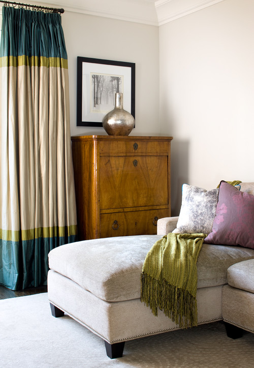
This aged cabinet maintains the marks of its history. No effort could make it perfect. The vignette on top is simple, asymmetrical and references the beauty and temporality found in nature. While there is austerity in the products, there is also tranquility.
Many examples of wabi sabi contain little or no colour, but I feel colour is not exclusive of this aesthetic. Here's a good example that has all the characteristics noted above. The marks of time are evident, even more so on colour.
The delicacy of pink blossoms against all the weathered wood pits naturalness against roughness.
Not every space that has wabi sabi characteristics looks exactly the same. All of these spaces have some wabi sabi elements.
I love the imprefection of this countertop against the modern, pristine cabinets. Am I the only person who craves warmth in countertops? Imagine the difference if this island were finished in granite.
Lots of natural materials, simplicity and economy is line and adornment, and a focus on the handmade.
If you want to find out more about this aesthetic ....
And remember ...
And a lesson we can all learn from Wabi Sabi....you can also interpret it in a much looser fashion to accept what you have as beautiful and to live with only what you need.
All links to images and many more examples on my Pinterest board Wabi Sabi
Langganan:
Komentar (Atom)


